|
|
Post by NetherFreek on Jan 20, 2017 16:28:24 GMT
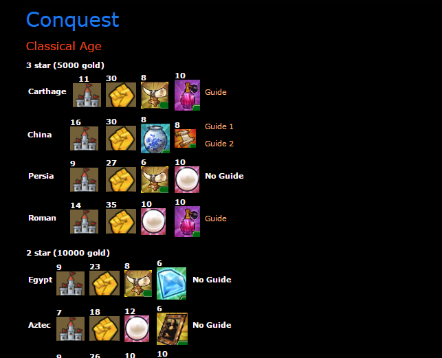
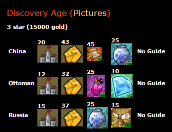
Hi, Today I Massively Changed the design of the conquest part of the list. it changed from this:  to this:  As you can see i went from a linewritten list, to a table list. This new list has an advantage that you can see the rewards better, however, the list is bigger so it takes more time to scroll down to your correct location. The poll is about whether you like the old one better, or the new one, the one with the most votes wins. I also changed a few other things (will be added for sure, the poll isn't about these changes) First I made for the last 3 ages a picture part: .org/image/grkunx5td/]  [/url] this picture redirects to Singlemalt pics of the conquests. It gives a short overview about the era. Furthermore i added the "industrial age" part of the list sincerly, NetherFreek |
|
|
|
Post by Singlemalt on Jan 22, 2017 12:07:49 GMT
NetherFreek,as I posted in the other thread I value your extra work! It looks nice and gives more info. It makes the list a bit long. Maybe the icons can be easily set a little smaller? I would not recomend this for campaigns since finding the correct campaign will take too much time
|
|